Brand Bible
System architecture & visual identity
01. Brand DNA and philosophy
Beyond Vision builds the bridge between digital infrastructure and high-end live production. The core of our aesthetic is clinical cleanliness. Our visual identity should feel as sharp as our backend code and as well composed as our camera angles.
Apple-inspired minimalism
We use generous white space, rounded corners (squircles), large arresting headlines and native interface elements such as SF Symbols, to create a native feel across web and iOS alike.
Code and camera
The ecosystem is holistic. The same design language speaks to the complex routing in a control room, the layout of a scoreboard, and the underlying SwiftUI code in our admin apps.
02. Colour palette and theme inversion
Our primary surfaces are built on extreme contrast. Vision White opens the interfaces up, while Vision Green acts as the system's interactive pulse.
Vision White
HEX: #FFFFFF
Vision Green
HEX: #76BA1B
Sailing Cyan
HEX: #00D2FF
Core Dark
HEX: #0E0E0E
Dark mode versus light mode
Beyond Vision's apps (Sailing Log and OSIS Camp Suite, for instance) require full dark mode support, to spare the eyes during night productions or night sailing.
- Inversion: Vision White (`#FFFFFF`) becomes Terminal Black (`#050505`). Core Dark (`#0E0E0E`) becomes white.
- Accent colours: Vision Green (`#76BA1B`) and Sailing Cyan stay constant and are never inverted. Their brightness guarantees clean contrast against a black background.
Glassmorphism in the dark
When the system switches to dark mode, our blur effects (backdrop filters) have to be adjusted to match.
background: rgba(255, 255, 255, 0.7);
backdrop-filter: blur(15px);
/* Dark mode */
background: rgba(20, 20, 20, 0.85);
backdrop-filter: blur(20px);
03. Typography
Inter Sans-Serif
Weights: Light (300) / Regular (400) / Medium (500) / Bold (700) / Black (900)
JetBrains Mono
Weights: Regular (400) / Bold (700)
04. Logos, modules and iconography
Beyond Vision operates a number of sub-brands and OSIS modules. Every system has its own visual identity and purpose, but they all speak the same minimal, Apple-inspired language.

BEYONDVISION
Design DNA: A three-dimensional, metallic mark shaped like a geometric aperture in Vision Green.
What it says: Technical precision, an understanding of hardware, and depth. The tactile, brushed-metal look represents the physical world — cameras, racks, hardware — while the glowing green stands for the digital code that ties it all together.
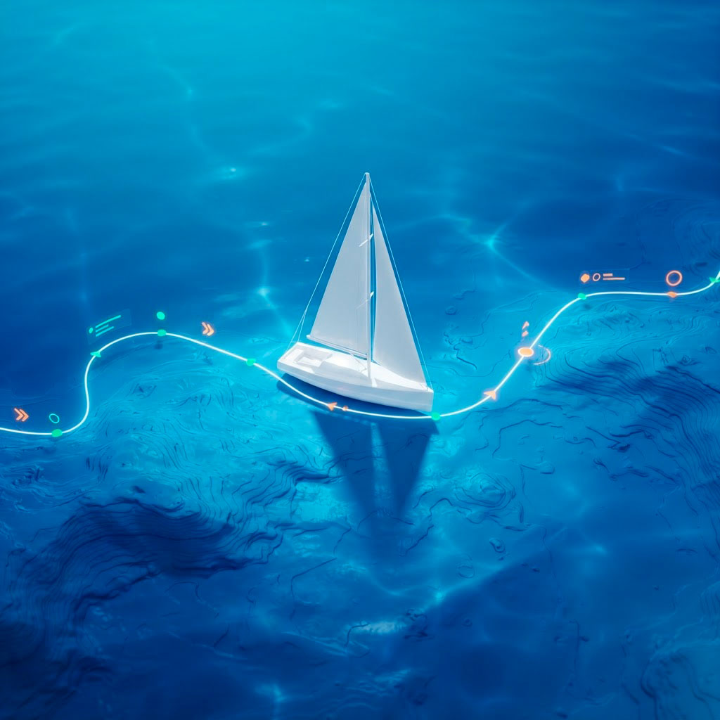
Sailing Log
Design DNA: Photorealistic and maritime. A white 3D sailing boat on a deep blue sea, overlaid with a glowing cyan digital route and neon data points.
What it says: The image captures the app's core purpose exactly: the fusion of the natural elements and digital tracking. The floating interface elements — nodes and lines — nod towards augmented reality and advanced navigation telemetry out on the water.

OSIS Camp Suite
Design DNA: A clean interface aesthetic built around the UI itself. Visual representations of check boxes, network nodes between profiles, and a phone screen with a green tick.
What it says: Fast participant handling and administrative oversight. The elements communicate a legible, cloud-based environment where complex processes (active check-in) are reduced to simple, satisfying green confirmations.
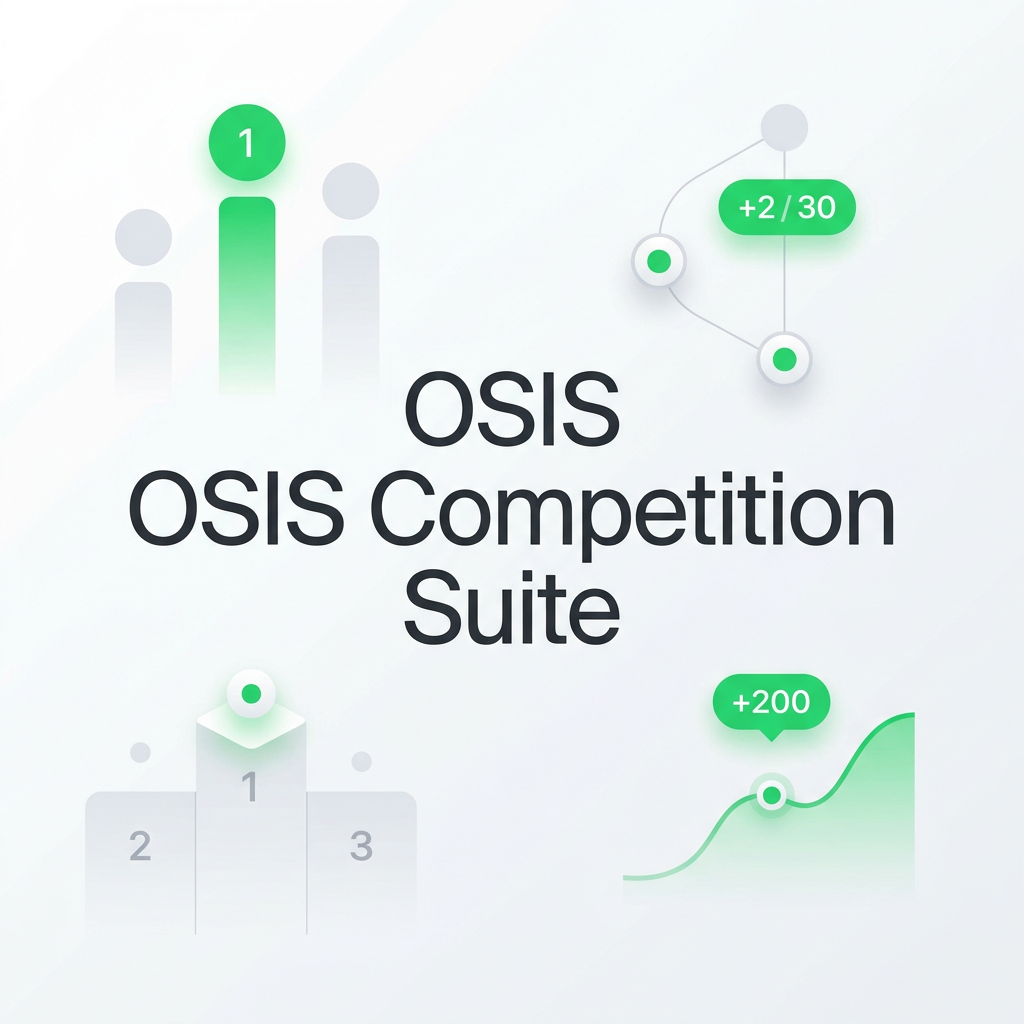
OSIS Competition Suite
Design DNA: Analytical, hierarchical and mathematically correct. The graphic shows podiums (1, 2, 3), rising form curves ("+200") and asynchronous point distribution.
What it says: Built for live data and judging under pressure. The visual language signals accuracy, instant scoring and leaderboards, with the green tones highlighting positive progress and a winning mentality.
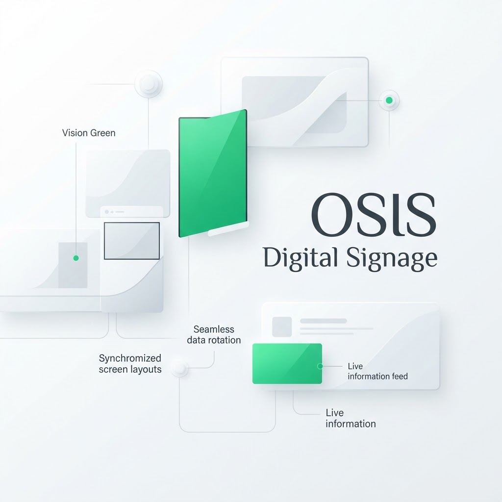
OSIS Digital Signage
Design DNA: Floating, synchronised screen grids. Thin grey lines connect the display panels in a clean white environment (Vision White).
What it says: Information flow and kiosk OS. It illustrates how one central system can distribute live information feeds and keep data rotating smoothly out to an unlimited number of physical screens in halls and at venues.

OSIS LiveSync
Design DNA: Extremely minimal. Thin, accelerating green data lines reminiscent of circuit-board traces or the light inside fibre-optic cable.
What it says: Speed. This is the core of live broadcast. The lines represent sub-millisecond latency, faultless video routing and real-time synchronisation between the control room, the hardware and the cloud, with no delay.
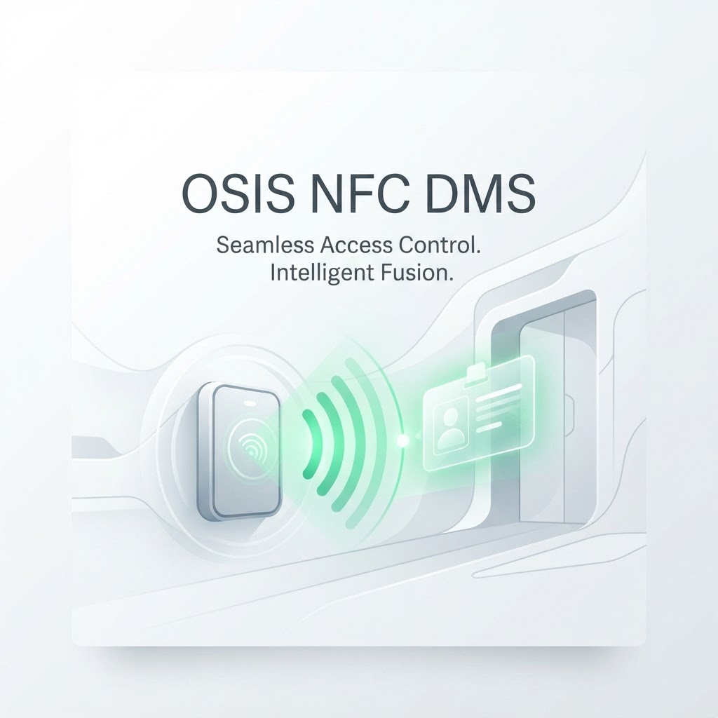
OSIS NFC DMS
Design DNA: A hardware-driven visualisation. A physical scanner mounted at an entrance, emitting glowing green radio waves and reading a floating digital ID card.
What it says: Seamless access control and intelligent fusion. It translates visually how physical hardware talks wirelessly to guests' wristbands or cards, allowing very fast, frictionless access management.
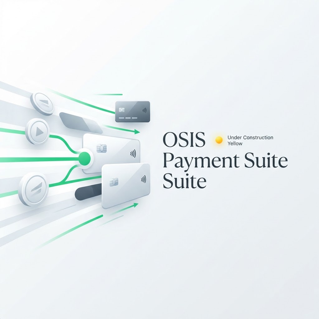
OSIS Payment Suite
Design DNA: Financial motion. Credit cards and NFC tokens shoot along green data lines towards a central transaction node.
What it says: Money moving. The logo visualises a fast, wired point-of-sale system. It also carries the specific yellow indicator ("under construction yellow") used to mark payment status or pending system processes, without breaking from the green master theme.
05. App development and SwiftUI standards
The codebase for our iOS applications follows strict visual rules, in order to keep the native Apple look.
SwiftUI components
- Squircles: Always use `RoundedRectangle(cornerRadius: 16, style: .continuous)` rather than standard rounding, to get the correct Apple curve.
- Icons: SF Symbols is the only icon library permitted in the app. The stroke weight must match the text's `font.weight`.
- Offline states: If the app loses its connection, it should use a discreet shimmer skeleton layout rather than loud error messages, until the backend data syncs.
Haptic feedback (Taptic Engine)
Physical feedback is critical when operating something like OSIS Payment Suite or NFC scanning.
- Success: A heavy, distinct vibration (UINotificationFeedbackGenerator — success) paired with a green tick.
- Navigation: An extremely light `.selectionChanged` vibration on tab changes and scroll locking.
06. Live production and broadcast graphics
When our systems feed vision mixers and big screens, they have to work perfectly alongside the technical hardware.
Screen graphics (scoreboards and overlays)
- Title safe: Important graphics — names, scores — must never sit in the outer 10% of the screen, to avoid being cropped.
- Chroma keying: Graphics that will be keyed out on hardware mixers are always generated on a pure green (`#00FF00`) or blue (`#0000FF`) background, depending on the graphic itself.
- Animation: Scoreboards must not pop in. They should use fluid easing curves and a consistent entrance.
Sound identity and Fairlight live
Our sonic brand should reflect the visual quality. Broadcast and audio mixing follow tight technical standards.
- LUFS standard: All broadcast audio mixing (in Blackmagic's Fairlight live, for example) must hit the international standard of -23 LUFS for a consistent listening experience.
- Interface sounds: Error and notification sounds from the OSIS systems should be soft and muted — never harsh alarm beeps.
07. Hardware and 3D-printed enclosures
Software and hardware merge. Our physical infrastructure should radiate the same cleanliness as our code.
3D printing and enclosures
When we make custom enclosures for hardware — Raspberry Pis for OSIS Signage, or protection for controllers — this rule applies:
Filament: Always print in matte white filament. The white surface extends Vision White into the physical world and gives the hardware a clean, clinical look rather than the usual black machinery.
Cabling and rack mounting
- Cable standards: To minimise visual noise at front of house or inside racks, cabling is kept to strict colour codes and tied neatly.
- Labels: Every port and custom enclosure is labelled exclusively with Dymo or printed labels set in JetBrains Mono, to carry the code aesthetic into the hardware.
08. T-shirt and merchandise print specifications
Clothing for Beyond Vision is our uniform. Different environments call for different print methods, but the design rules are fixed.
Setup and design
- File format (vector required): All print files must be delivered to the printer in pure vector format (.AI, .EPS or vector PDF). Raster graphics (.PNG/.JPG) are strictly forbidden for textiles.
- Placement: The logo goes consistently on the left chest. The size should be discreet and professional (roughly 8–10 cm wide).
- Crew titles: If the garment includes a functional title (for example "SCREEN PRODUCER"), it sits across the shoulder blades on the back, set in JetBrains Mono to keep our tech DNA.
Print technique and setting
- Live crew (on site): The base colour is always black (Core Dark), to blend into the dark behind cameras and mixers. Here we use hard-wearing screen printing that can take cable pulling, sweat and many washes.
- Office and meetings (off site): White or black T-shirts and hoodies. Here high-end transfer printing can be used to get razor-sharp lines and perfect reproduction of Vision Green, without the garment feeling heavy.
09. Business cards and social assets
Rules for personal and formal representation of the brand.
Business card formatting
To keep the right visual hierarchy between person, title and company, the name Sebastian Krogh Melgaard must always be set in grey in the business card layout. White must not be used for the name on a business card.
LinkedIn and social media
All imagery for formal platforms such as LinkedIn must be formatted as standard, high-quality rectangular images or banners. Formats intended for app icons (iOS squircles) must never be used for general posts or profile headers.
10. Presentations and slides
Slides are the brand in meeting rooms, pitches and online talks. The same clinical cleanliness as the web and the app: a dark background, extreme contrast, generous white space and one clear message per slide. A deck should feel like an extension of our interface — never like a loud sales show.
Foundation
- Format: 16:9, dark mode as standard.
- Background: Terminal Black (`#050505`) or Core Dark (`#0E0E0E`).
- Air: 5–6 points per slide at most — better more slides than one overcrowded one.
- Corners: cards and boxes use squircles (16px continuous), never sharp boxes.
- Title safe: keep important content out of the outer 10% (the same rule as broadcast graphics).
Typography on slides
- Titles and body text: Inter — Black (900) for headings, Regular/Medium for text.
- Labels, numbers, page numbers and eyebrows: JetBrains Mono — it carries our code and data DNA.
- Body text in Vision White (`#FFFFFF`); large headings with tight letter spacing.
- Key figures (nautical miles, points, latency) are set large in JetBrains Mono.
Accent colours
Vision Green (`#76BA1B`) = action, calls to action and positive progress. Sailing Cyan (`#00D2FF`) = titles, links and data. The accents are never inverted — their brightness guarantees contrast against the black. Yellow is used only for status and pending states (as in Payment Suite), never as decoration.
Animation and transitions
Slides and elements must not pop in. Use soft, fluid easing curves and a consistent entrance — exactly the same rule as scoreboards and overlays. Better no animation at all than a hard transition.
background: #050505; // Terminal Black
title: Inter 900 — #FFFFFF / Sailing Cyan
body: Inter 400 — #EDEDED
eyebrow: JetBrains Mono 700 — Vision Green (UPPERCASE)
accent: Vision Green (BV) · Sailing Cyan (Sailing Log)
The Beyond Vision deck
Primary accent: Vision Green. A technical, broadcast-oriented tone. The aperture logo discreetly at the top, page numbers in JetBrains Mono at the bottom. Used for infrastructure, OSIS and hardware pitches.
The Sailing Log deck
Primary accent: Sailing Cyan. A maritime feel — deep blue and black with cyan route lines and neon data points as subtle graphic elements. Used for investor, club and marina presentations.
Do
- Dark background and one message per slide.
- Large numbers in JetBrains Mono.
- Vector or high-resolution PNG logos.
- Consistent easing on every transition.
Avoid
- White backgrounds in a live or pitch context.
- More than 6 bullets on one slide.
- Clip art, heavy drop shadows and loud gradients.
- Inverting or watering down Vision Green / Sailing Cyan.
// The auto-generated "Sailing Log Almanac" deck (Google Slides Apps Script) follows this master: Terminal Black background, Inter + JetBrains Mono, cyan and green accents.